
I never grew up around horses, or with a family background in racing. My interest stems from a combination of my passion for sport and numbers. My approach has always been to solve the puzzle and locate value.
This view remains unmoved.

Pride Of Donegal – When Ability, Form and Suitability Align
6 March 2026
This example walks through the exact framework outlined on The Figures Explained page, using a real race as a working demonstration.
The objective isn’t to highlight a result.
It’s to show how the structure works before the race is run.
Step 1 – Proven Ability
Every Paceform race is ranked from highest Top Figure to lowest.
That immediately establishes the ability hierarchy.
In this race, the ranked Top Figures were:
-
Pride Of Donegal – 86
-
Don Simon – 84
-
Market House – 81
-
Francesco Baracca – 80
-
Thankyou Baroness – 70
-
Intinso – 62
The first question from the framework:
Has this horse already achieved a level high enough to win this race?
Pride Of Donegal had.
An 86 was the highest proven 12-month performance on today’s surface (All-Weather).
He began as the clear ability leader.

Red outline: Top Figure column. Black outline: Last Time Out Figure.
Step 2 – Current Form (Last-Time-Out)
Next, we test whether that ability is currently being reproduced.
Pride Of Donegal’s LTO Figure: 83
That sits close to his Top Figure of 86.
This tells us:
• He is operating near peak level
• He is not arriving off regression
• The ability ceiling is active, not historic
By contrast:
Don Simon’s LTO was competitive at 84, but with a lower overall Top Figure ceiling (84 vs 86).
The structure now shows:
Highest ability + competitive recent form.
That combination narrows the field.
Step 3 – Suitability to Today’s Conditions
Raw ability and form must be supported by environment.
Now we test whether the conditions allow reproduction.
We examine:
• Course
• Distance
• Going
• Weight
Course
The strongest Course figure in the race was 84 (Intinso).
Pride Of Donegal showed –1, meaning his best Course figure was 83.
Proven and competitive at the track.
Distance
Pride Of Donegal showed 86 — bolded.
Best Distance figure in the race.
He had already achieved his Top Figure at this trip.
Strong alignment.
Going (Surface)
Best Going figure in the race was 85.
Pride Of Donegal showed –2, meaning 83.
Again, competitive and proven.
Weight
Pride Of Donegal showed 86 — bolded.
Best Weight figure in the race.
He had already delivered his peak while carrying a similar weight.

Conditions panel showing suitability alignment.
What The Profile Looked Like Before The Race
Putting the structure together:
• Highest proven ability (86)
• LTO close to peak (83)
• Best in race for Distance
• Best in race for Weight
• Competitive at Course and Going
This is what alignment looks like.
Not perfection across every column.
But no contradictions.
Ability, form and suitability reinforce one another.

Full race view showing ability, form and suitability together.
What Happened
Pride Of Donegal made the running and won the race.
The ability hierarchy broadly held:
• Top rated won
• Next highest finished close behind
But the outcome is secondary.
The structure was clear before the race.
The figures did not predict improvement.
They identified the runner most likely to reproduce a competitive level under the conditions.
What This Illustrates
This example demonstrates the framework in action:
• Establish the ability hierarchy
• Confirm recent form
• Test suitability
• Look for alignment, not perfection
The figures aren’t designed to create certainty.
They are designed to reduce ambiguity.
What To Do Next
Apply the same process to today’s races:
-
Start with the Top Figure
-
Confirm LTO proximity
-
Read across the Conditions panel
-
Look for reinforcement
When ability, form and suitability align, the profile strengthens.
When they don’t, step aside.
That discipline is part of the edge.
👉 View Today’s Paceform Figures
(See the same process applied to live races.)
Rob, Paceform Figures
When Historic Condition Figures Distort the Picture
18 February 2026
Not every standout condition figure should carry equal weight.
Occasionally, a runner will show dominant course, distance, going or weight figures — yet the 12-month Paceform rating tells a slightly different story. Understanding why that happens is important.
This isn’t about dismissing past ability.
It’s about recognising when that ability hasn’t been reproduced recently.
Overall figures: the current operating level
The blue column, the overall Paceform Figure, represents a horse’s best performance in the last 12 months.
That time filter matters.
It ensures the headline rating reflects current capability — not a peak achieved several seasons ago under different circumstances.
When a horse tops the overall 12-month figures, it means:
Within the last year, it has operated at a level superior to the rest of the field.
That is your baseline.
Condition figures: career bests, not time-restricted
The course, distance, going and weight columns work differently.
These figures reflect career-best performances under those specific variables.
They are not restricted to the last 12 months.
This distinction is deliberate.
It allows you to see whether a horse has ever achieved a high level under today’s setup.
But it also introduces nuance.
If a condition figure is higher than the 12-month overall rating, it tells you something specific:
That peak was not achieved within the last year.
It is historic.
A practical example
In the Wolverhampton 6f handicap shown below:
-
Woodhay Whisper was top-rated overall on 85
-
Water Of Leith showed 91 for course, distance and going

Highlighted: Woodhay Whisper top rated overall (85) despite Water Of Leith's historic 91 condition figures.
At first glance, Water Of Leith appeared dominant on the conditions panel.
However:
-
Water Of Leith’s 12-month overall figure was 84
-
His 91 condition figures therefore exceeded his recent operating level
Those 91s were career peaks — not recent evidence.
Woodhay Whisper’s slightly negative condition markers were not weakness.
They simply reflected comparison against Water Of Leith’s historic highs.
Crucially, Woodhay Whisper had already demonstrated the ability to produce an 85 within the last 12 months — and that was sufficient for this race. That 85 was reflected in the course, distance and going columns as “-6” — simply the difference between Woodhay Whisper’s 85 operating level and Water Of Leith’s historic 91, which was the highest conditions figure in the race. We can conclude: Woodhay Whisper had the highest Paceform Figure in the last 12 months (85) and was capable of repeating that under todays conditions.
It’s not impossible for Water Of Leith to rediscover those old peaks. But without recent evidence, the more grounded conclusion was that he was comfortable under these conditions — but not operating above 84.
The key question wasn’t who once ran the biggest number.
It was who was still capable of running theirs today.
Woodhay Whisper was. Water Of Leith wasn’t.
Why this matters
Historic track form is visually powerful.
But racing performance is dynamic.
A figure achieved two or three seasons ago does not automatically carry the same predictive weight as a recent, repeatable 12-month figure.
The Paceform structure separates the two:
-
Overall rating = current ceiling
-
Condition rating = evidence of past suitability
When those two conflict, recency often deserves greater emphasis.
What this illustrates
This isn’t about ignoring condition figures.
It’s about weighting them correctly.
When a condition number exceeds the 12-month overall rating, it signals:
-
The performance wasn’t recent
-
There is no current confirmation of that level
-
The horse may not be operating at that historic peak anymore
In those cases, the 12-month overall Paceform Figure is the more reliable measure of current ability.
Historic condition peaks confirm suitability — but the realistic ceiling is defined by what the horse has actually achieved within the last 12 months.
What to do next
When reviewing today’s races:
-
Start with the 12-month overall rating as your foundation
-
Use condition figures as confirmation, not distraction
-
Question condition peaks that exceed recent operating levels
-
Avoid letting historic highs override current evidence
The figures don’t erase the past.
They simply help you distinguish past peaks from present capability.
And in competitive handicaps, that distinction often decides which numbers truly matter.
👉 View Today’s Paceform Figures
(See the same process applied to live races.)
Rob, Paceform Figures
Drama – When a Surface Switch Restores the Signal
22 January 2026
Drama’s run at Kempton (6/9/25) was a clear example of how the Paceform Figures can cut through misleading recent form when a horse returns to its preferred surface.
On paper, the most recent run looked uninspiring — a modest effort on turf.
Within the figures, however, that run sat clearly outside the horse’s established performance range under today’s conditions.
Rather than reacting to the headline result, the figures highlighted a familiar and repeatable pattern: Drama performs at a materially higher level on the all-weather than on turf.
Recent form: separating surface from ability
Looking only at the most recent run, Drama recorded a Paceform Figure of 74 on turf — a performance that sat well below the level required to stand out in this field.
That number, however, was not an isolated data point. When the last six runs were viewed in sequence, a clear surface-based split emerged.
Drama’s Paceform Figures from oldest to newest read:
28 → 70 → 89 → 94 → 88 → 74
The distinction was unambiguous:
-
Turf runs (red boxes): 28, 70, 74
-
All-weather runs (white boxes): 89, 94, 88
Rather than indicating regression, the most recent turf run simply aligned with a recurring pattern — turf suppresses Drama’s output, while the all-weather allows it to be expressed.
This is precisely the type of situation where raw recent form can mislead if surface context is ignored.

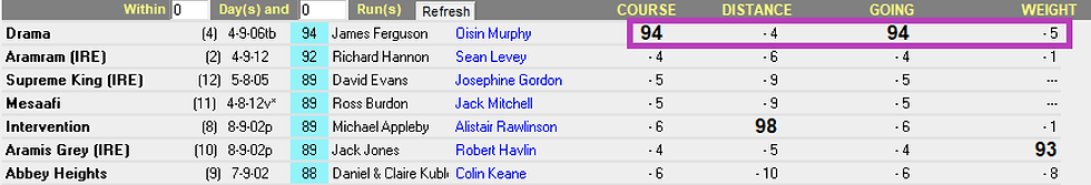
Highlighted: Drama’s last six Paceform Figures — turf runs (red) sit well below the all-weather figures (white).
All-weather figures: restoring the baseline
When attention returned to Drama’s all-weather profile, the picture sharpened immediately.
On the Paceform Figures for this race:
-
Drama was top-rated overall by 2 points
-
The top career figure (94) had been achieved under today’s conditions
-
Course and going figures both returned 94, confirming suitability rather than raising questions
-
Distance and weight ratings sat close to the top of the field, with no contradictions present
Rather than projecting improvement, the figures showed that Drama had already operated at this level — and that the environment required to reproduce it was firmly back in place.
Why the conditions mattered
The conditions panel was particularly important here.
Drama’s best-ever Paceform Figure (94) had been recorded at Kempton on the all-weather, under conditions closely matching those faced today. That historical confirmation matters far more than a single recent turf run achieved under unfavourable circumstances.
In effect, the return to Kempton didn’t ask Drama to improve — it simply removed the constraint that had been suppressing performance.
What this illustrates
Drama’s profile is a textbook example of the Preferred Surface Return angle in practice:
-
A recent poor run explained by surface rather than form
-
Clear, repeatable superiority on the all-weather
-
A top-rated overall position once surface context is restored
-
Conditions that confirm, rather than contradict, the best historical figures
This wasn’t about ignoring recent form — it was about interpreting it correctly.
Why this matters
Surface switches are one of the easiest ways for genuine ability to become temporarily obscured.
When a horse consistently underperforms on one surface but repeatedly delivers higher figures on another, the data provides clarity that visual form lines often can’t.
The Paceform Figures don’t excuse poor runs — they contextualise them.
What to do next
When reviewing today’s races:
-
Don’t treat all recent runs as equal — check where the figures were achieved
-
Look for horses returning to the surface on which their best figures were recorded
-
Use the conditions panel to confirm that suitability has already been demonstrated
When surface, ability, and conditions align, the figures often restore the signal that recent form has blurred.
👉 View Today’s Paceform Figures
(See the same process applied to live races.)
Rob, Paceform Figures
Marching Mac – When Ability Meets Course Suitability
13 January 2026
Marching Mac’s win at Leicester (28/10/25) was a clear example of how combining overall ability with proven course performance can highlight a strong setup — even without a standout last-time-out figure.
This was not a case of chasing recent form.
Instead, the figures highlighted a runner whose established ability level — when paired with a dominant course profile — positioned him to run close to his ceiling again.
Overall figures: a clear ability edge
On the 12-month Paceform Figures, Marching Mac stood out as the top-rated horse in the race, holding a two-point advantage over the next best rival.
That margin mattered. In a relatively small field, it separated Marching Mac as the runner with the highest established performance level, rather than one merely matching the opposition.
At this stage, the profile already suggested ability — but ability alone doesn’t always translate unless the conditions allow it to be expressed.
Course figures: where the edge became decisive
When attention moved to the course figures, the picture sharpened further.
Marching Mac recorded a course figure of 91, which was eight points clear of the next best course rating in the race. That level of separation is rarely incidental and pointed to Leicester as a track where the horse had previously performed well above his peers.
Rather than projecting improvement or relying on assumptions, the figures showed that Marching Mac had already demonstrated his best form under similar course conditions.

Highlighted: Marching Mac’s top overall figure (94) and dominant course figure (91).
Supporting factors, not dependencies
The remainder of the profile supported the setup without driving it.
-
Last-time-out: A solid effort, ranking third best — competitive, but not eye-catching
-
Distance: Top-rated in the field
-
Going: Respectable rather than dominant (4th best)
Importantly, the profile didn’t rely on a peak last-time-out performance. Instead, the strength of the setup came from baseline ability combined with a proven affinity for the track.
This is often where these profiles are most reliable — not when everything aligns perfectly, but when nothing contradicts the core strengths.
Why this matters
Some horses naturally peak at specific tracks.
When the top-rated horse overall is also clearly proven at today’s course, the conditions often allow them to run close to their established ceiling.
In these situations, course suitability doesn’t add noise — it removes doubt.
What this illustrates
Marching Mac’s profile is a good example of the Top Rated + Top Course angle in practice:
-
Clear top-rated horse on the 12-month figures
-
Dominant course figure relative to the field
-
Supporting distance and going figures
-
A solid, non-contradictory recent run rather than a forced narrative
It doesn’t guarantee outcomes — but it does help identify races where ability and environment are aligned rather than at odds.
What to do next
When reviewing today’s races:
-
Identify the highest-rated horse on the 12-month figures
-
Check whether that ability has already been expressed at today’s course
-
Use the surrounding figures to ensure nothing undermines the setup
When ability and suitability reinforce each other, the figures often provide clarity that headline form alone can’t.
👉 View Today’s Paceform Figures
(See the same process applied to live races.)
Rob, Paceform Figures
Time Tested – When Recent Form Meets Repeatable Conditions
9 January 2026
Time Tested’s run at Chelmsford (2/1/26) was a good example of how a strong last-time-out figure can take on greater significance once suitability is confirmed through the figures.
The overall 12-month rankings didn’t outline Time Tested as a standout candidate on their own. It was the most recent run, viewed alongside today’s conditions, that changed how the profile looked once the figures were placed in context.
Overall figures: informative, but not decisive
The 12-month figures reflected a solid level, but they didn’t mark Time Tested out as a standout on their own. Ranked third overall, the profile appeared competitive rather than obvious. It was the last-time-out figure that changed the picture, creating clear separation once attention moved away from headline rankings and onto recent performance.
Last-time-out figures: identifying the separation
When attention moved to the most recent performance, a clearer distinction emerged.
Time Tested recorded the best last-time-out figure in the race, sitting seven points clear of any rival’s most recent figure. That margin was large enough to stand out as a meaningful performance edge rather than routine variation.
At that stage, the question wasn’t whether the figure was strong — it was whether today’s conditions were suitable for that level of performance to be repeated.

Conditions: confirmation within the figures
That confirmation was visible directly on the page.
Time Tested was ranked highest for course, distance, and going, indicating that the last-time-out figure had already been achieved under conditions matching those faced today. Rather than projecting improvement or assuming suitability, the figures showed that the relevant boxes were already ticked.
In this context, the last-time-out figure carried additional weight because the conditions required to reproduce it were clearly in place.
Why this matters
A horse doesn’t need to be top-rated overall to become the most interesting runner in a race.
When a clear last-time-out best is paired with figures that confirm suitability under today’s conditions, that recent performance can outweigh higher overall ratings achieved under different circumstances.
This is particularly useful in races where headline rankings alone don’t tell the full story.
What this illustrates
Time Tested’s profile is a good example of how the figures can be used to bring clarity:
-
A runner not top-rated on the 12-month figures
-
A standout last-time-out performance relative to the rest of the field
-
Conditions boxes that confirm suitability rather than raise questions
-
A profile that strengthens once recent performance is viewed in context
It doesn’t guarantee outcomes — but it does help identify situations where a recent figure is supported rather than contradicted by the conditions in place.
What to do next
Apply this same approach when reviewing today’s races.
Start by identifying runners with a clear last-time-out edge, then use the Paceform Figures to confirm whether today’s conditions are suitable for a repeat of that performance.
Use the figures to compare current ability in context, and let the data guide the process before the narrative forms.
👉 View Today’s Paceform Figures
(See the same process applied to live races.)
Rob, Paceform Figures
Westcombe – When Improvement Reveals Itself
4 January 2026
Westcombe’s win at Kempton on Wednesday 17/12/25 was a good example of how the Paceform Figures can highlight unexposed improvement, even when there’s limited course or distance history to lean on.
Rather than relying on past suitability, this was a case where the shape and direction of the figures told the story — particularly when set against a field made up largely of exposed profiles.
The context: limited history, open questions
Unlike some profiles that arrive with strong course-and-distance credentials, Westcombe entered this race without prior form at Kempton and without experience at the trip.
That lack of history can often introduce uncertainty — but it can also mask improvement when a horse is still early in its career.
Westcombe had just five career runs going into the race, meaning there was still scope for development that wouldn’t yet be fully reflected in traditional form lines.
Paceform Figures: identifying the step forward
When the Paceform Figures were applied, the key signal wasn’t a single standout rating — it was the trajectory.

Westcombe’s sequence of Paceform Figures read:
69 → 66 → 64 → 71 → 83
The most recent run represented a clear step change, producing an 83 that was comfortably the best figure the horse had recorded to date.
That improvement mattered for two reasons:
-
It came last time out, suggesting current form rather than historical ability
-
It meant Westcombe was entering this race as the one with scope for further improvement, against rivals whose figures had already stabilised
In this context, Westcombe’s rating placed him near the top of the overall figures, despite lacking the same depth of exposed form as some rivals.
Why exposed opposition matters
In races like this, raw rankings can be misleading without context.
Several runners in the field had accumulated solid but familiar figures over many starts. Westcombe, by contrast, had fewer runs but had just produced a figure that exceeded his previous ceiling.
This is often where unexposed improvers can be underestimated — not because they lack ability, but because the improvement hasn’t yet been fully priced in.
The Paceform Figures don’t assume improvement.
They simply measure it when it happens.
A different Paceform scenario
This was a different scenario to Weddell Sea.
There was no reliance on course, distance, or going history. Instead, the focus was on recent progression and how that progression compared numerically with the rest of the field.
It’s a reminder that the figures aren’t just about identifying proven profiles — they’re equally effective at highlighting change, especially when that change occurs against exposed opposition.
What this illustrates
Westcombe’s win is a good example of the type of situation the Paceform Figures are designed to surface:
-
Limited career exposure
-
A clear step forward in the most recent figure
-
Improvement that stands out once placed alongside the opposition
It doesn’t guarantee outcomes — but it does help bring clarity where traditional form can lag behind reality.
What to do next
Apply this same principle when reviewing today’s races.
Look for runners with few career starts, then assess whether the Paceform Figures show a recent step forward that hasn’t yet been absorbed by the wider market.
Use the figures to compare current ability, not reputation — and let the data speak before the narrative forms.
👉 View Today’s Paceform Figures
(See the same process applied to live races.)
Rob, Paceform Figures
Weddell Sea – When the Data Aligns
17 December 2025
Weddell Sea’s win at Newcastle on Tuesday 16/12/25 stood out not because of a single number, but because multiple independent Paceform Figures were pointing in the same direction beforehand.
This was a clear example of how the Paceform Figures quantify both ability and suitability - and how powerful the profile becomes when those elements align.
Ability: a clear overall edge
On the day, Weddell Sea:
-
Recorded the best Paceform Figure overall (88)
-
Posted the best last-time-out figure (80)
This established both a ceiling advantage and confirmation of current form.
It wasn’t simply that he had run well before — it was that his most recent performance was also the strongest in the field.
Suitability: proven under the condtitons

Beyond overall ability, Weddell Sea also ranked highest for:
-
Course
-
Distance
-
Going
That alignment removed the common uncertainty around whether a horse’s best numbers were achieved under comparable conditions.
Here, the historical suitability and current form were consistent.
Why this matters
This is a good example of how the Paceform Figures work when used as intended.
Rather than relying on a single standout statistic, the strength of the profile came from:
-
Overall rating advantage
-
Strong recent performance
-
Proven condition suitability
When multiple figures reinforce one another, the data becomes clearer and more actionable.
It does not guarantee an outcome — but it reduces ambiguity.
A typical Paceform scenario
Weddell Sea represents the type of profile the Paceform Figures are designed to highlight — not speculation, but alignment.
When ability and suitability converge numerically, the edge becomes more defined.
For newer users, this is a practical example of what to look for:
A horse that is not only top rated overall, but also supported by recent performance and relevant condition figures.
What to do next
Apply this same analytical framework to today’s racing.
Look for runners where:
-
The overall figure stands out
-
The last-time-out rating confirms current form
-
The condition figures support suitability
👉 View Today’s Paceform Figures
(See the same process applied to live races.)
Rob, Paceform Figures
Figures in Focus: Stratusnine’s 92 Signals More to Come
16 December 2025
Stratusnine caught the eye when winning a Class 3 handicap over 6f at Wolverhampton on 8 December, producing a performance that stood out clearly on both time and sectionals.
Stopping the clock at 72.00 seconds, the gelding recorded the fastest 6f time on the card by a wide margin. To put that into context, the performance was over 16 lengths quicker than the maiden winner in the previous race, more than 13 lengths faster than the winner of the following 6f handicap, and almost 7 lengths quicker than Twilight Madness, who landed another 6f handicap later on the card.
The race itself was run at an even pace, allowing the form to be assessed cleanly. Stratusnine was positioned close to the speed throughout and travelled strongly, showing no signs of being pressured into the effort. When a gap appeared up the rail entering the straight, he quickened decisively and went on to win by 2¼ lengths, doing so with something in hand and without maximum urging from his jockey.
From a finishing speed perspective, the performance was equally convincing. Stratusnine ran the final two furlongs in 22.46 seconds, with both furlongs run in 11.23 seconds — quicker than all eight of his rivals and notably strong through the line, suggesting the effort was sustained rather than pace-assisted.
The performance earned a Paceform Figure of 92, which is significant in this context. The average Class 3 older-horse handicap winner typically records a figure of 90, so a 92 indicates a level of performance capable of holding up in a stronger grade. Given the manner of the victory, there is a reasonable case to suggest the figure may not fully capture his ceiling.

Looking at the wider profile adds further substance. This was only Stratusnine’s second start on the all-weather, just his second run following a 402-day absence and a gelding operation, and only the sixth run of his career. The step forward from his previous figures is clear, and the conditions of the race offer little reason to downgrade the merit of the effort.
Taken together — the time, the even pace, the strong closing sectionals, and the profile — this was a performance that stands up well on objective analysis. Stratusnine is a horse to keep firmly in mind over the winter months, particularly if continuing in similar conditions, as the Paceform data suggests there could be more to come.
This is a typical example of the type of horse the Paceform Figures are designed to highlight — a performance that stands out on the data and points scope for further improvement.
Rob, Paceform Figures